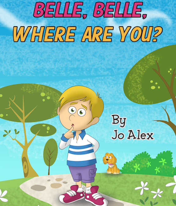
Children’s eBook/interactive for the Ipad
The Idea
I sent out a word that I was looking for an illustrator for Children’s eBook. Illustrators are harder to find that I thought. After speaking with several of my family members and friends, I sent a bid for Illustrator for Children’s eBook to Elance, what is now Upwork now. The description indicated that self-published author has written a children’s book about a cute cocker spaniel dog. The storyline is about a little kid is looking for the dog in various places of the house.
I received at least a dozen proposals; some even came with samples without even asking. There were some awesome illustrations that blew me away. I finalized the proposals down to two companies.
Then I reviewed my requirements with both of the Illustration companies. Some of the buzzwords that I used: simple eBook on Ipad App, cartoony, colorful, and not too complex, and made for children ages 3-7, a 20-page children’s e-book and the images needed will be featuring the cocker spaniel in living rooms and indoor spaces.
I selected the company that drew animal figures before. I loved the color schemes that they chose for one of the additional samples that they sent me to review.
The company had different price ranges for different drawings. I asked for sample drawings for each range. The prices were linked to the time needed for drawing the image. After an agreement, we, the illustrator and I got to work, going through a project manager
Problems and Decisions:
I had encountered some problems that I didn’t think about at all with children’s eBook publishing. Naively, I thought I wrote the story and someone just drew on the other end, even if this was going to be a self-published children’s eBook.
Here are few problems that I encountered getting down to work:
In working with the illustrator, there were more questions to be answered. There were 3 main issues that we encountered based on my story needs:
1. Portrait or Landscape
Should the children’s eBook be in portrait or landscape?
I didn’t know what the difference was at the time.
The illustrator company told me that they preferred landscape. They wanted to do a kindle format 16 x9. During my research, I reviewed free samples of many children’s eBooks. I had noted that some of the traditional children’s books were in portrait mode; however, if it had big pictures it seemed the book was in landscape mode.
I talked to a techy friend who also reviewed some of the portrait and landscape. I purchased a few children’s eBooks books for Kindle and the Ipad to get the full experience. We realized that Ipad and Amazon have 2 different reader experience.
At the time of the book, the Ipad screen (tested with I pad 4) had 4:3 aspect ratio which was different ratio from the kindle. My primary target device was the Ipad and then the Kindle.
In some of the children’s eBook we tested, it revealed that:
- Height was compromised in portrait mode
- Width was compromised in landscape mode.
- In some of the eBooks, the eBook cover looked like it was in portrait but as you turn the pages, they looked like they were in landscape.
- It seemed like some of the books went with more of squarish photo and was letterboxed on the sides for Ipad. A square photo is a compromise for people who wanted to look it at in landscape and portrait mode.
The way my friend explained about the portrait and landscape differences. “In portrait, I see the picture with distance capture. You get more of a distance in portrait; you get more space with the portrait photo. In landscape, you can put more things landscape. In landscape, I see the full picture
Essentially, what they were saying was that you can fit more things on the landscape screen, like a movie in landscape. You can’t fit more things horizontally because there is not much room.
The result: landscape image at 300dpi at a 2048×1536 resolution. This will allow the image to fill the screen of the retina iPad, and the new iPad Airs have a dpi of 264.
2. File format: Vector or not vector
I did more research on children’s eBooks that were published in both vector and non-vector.
One feature I really liked about vector images was that the photos dynamically resized itself. Non-vector images did not do that.
The non-vector images had a different appeal to my eyes. The books that I liked were the custom art hand drawn ones.
I sent a few examples to the illustrator to give them an idea of what type of non-vector illustration that I would like to see in my children’s eBook.
3. Fixed layout versus non-fixed layout
Again my techy friend helped out with the explaining. Fixed layout – “The picture is going to be 800 pixels no matter what. The image will size the screen the best way it can. Fixed layout- does not change. The photos will fill up the screen without losing quality. It doesn’t reflow depending on the size of the device.”
There were so many device sizes (different generations of Kindles and Ipads) and it was hard to make it look perfect on all the device sizes.
I still had a problem. The eBook publisher that I was thinking about going through to publish only did a fixed layout for the Ibook. They didn’t do children’s eBook for the Kindle. I had more questions for the publisher about the layout. The publisher was not totally answering my questions. The publisher told me to look at a few samples that they published.
My friend told me that I should just use the iBook’s author app. What? Yes, he convinced me to hire him to do the IBook’s author instead of going with the publisher since my friend had a better grasp of the Ipad technology.
Text for the Story
The illustrator company suggested having a final text ready before the illustration starts. This allows them space needed to position the text in the picture. I was totally done with my text and proofread by an editor. I was trying to capture both the iPad and Windows readers so I wanted to make it as text friendly as possible to both audience
Animate the characters/interactive book
At the time of the development of the book, I learned that Kindle didn’t support children’s interactive book. I told the illustrator that it would be way cooler that if I did the animation sounds with my techy friend, which I did.
In the end, what I learned was good problem-solving skills require good knowledge. Good knowledge requires good research.
To get an iBooks Author demonstration for Belle, Belle, Where are You?: please click here.

